Many Precious Blessings

Mar 29, 2011

Dress-Up Time

My older daughter took this photo of her little sister one afternoon while they were having a fashion show. I loved this photo, but there was a rather distracting pile of coats and junk in the background. Sometimes it's hard to get a perfect photo around my house!  There's always something cluttering up the background - dishes, toys, remodeling stuff, TRASH.  


So I practiced using the selection tools in Photoshop to extract her from the background and then I placed her in fairytale land.  Now this is a more pleasing backdrop don't ya think?  When I showed her this layout, she said "I like the pink castle!"

  Credits-
ScrapSimple Digi Layout Templates - StorybookCastle by Amanda McGee
Page Frames by Penny Springmann

Mar 24, 2011

Quick and Simple Room Re-do

I helped my niece (age 16) redecorate her room on a Saturday afternoon a few months ago.  (Yes, we did this in ONE day!)  We began by choosing new bedding at Kohl's, and visiting the paint store for matching wall colors.  We found some circle stencils and more matching paint at Hobby Lobby.  We also found some little circle mirrors in various sizes.  It's hard to tell in the photo, but some of the circles are actually those mirrors.  We had fun painting together all afternoon, and she was pleased with the result.  

I'm planning on doing this same "circle" theme in my daughter's room soon.  Why not re-use the stencils I purchased?  Stay tuned for those pictures!

What the kids have been up to lately...

I've been busy scrappin' a few pages lately - trying to get caught up before spring and summer arrive and I leave the computer to go be outside!
Credits-
Template:  Scrap Your Heart Out 2 by Janet Phillips (page 5)
Papers, Elements:  On The Loose by Shawna Clingerman and Dani Mogstad
"dollar" embellishment:  Nest Egg Collection by Trish Yochum
Font:  Once Upon a Font by Darcy Baldwin


I've seen many layouts with a little cluster of embellishments (or a photo) off to the side or corner all by themselves, and I've never understood it. If anyone knows the design concept behind it, please let me know.  So this is the first time I've tried it. I'm out of my comfort zone...this is fun!


Credits-
Layout lift of "my sunshine" by Giseli Freitas
Frames (recolored): Spring-A-Ling by Melissa Bennett
Papers, Elements:  Lil Miss Funfetti by Julie Billingsley
Font:  LisaB by Darcy Baldwin

Credits-
QuickPage freebie from Traci Reed's design team using her Maude & Millie kit
Alpha from Sweet Shoppe Designer collaborative "once upon a girl/boy" (recolored)

Mar 18, 2011

Painting Cheap Laminate Furniture - it CAN be done!

Through the inspiration of a friend and the help of a this article, I set out to improve the looks of this cheap cart I've had since 1990.  Notice the peeling laminate along the top edge.


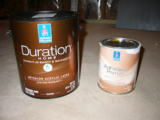
First, I disassembled it, and cleaned off the dust.  :o)  I gave it a light sanding with 150 grit sand paper, and peeled away any loose/bubbled laminate.  Then I began with a coat of Adhesion Primer using a really soft 100% nylon brush.  I tried using a foam roller, but I didn't like the texture it left.


Then I put on 2 coats of black paint.  I waited a couple days between each coat.  This really tested my patience.  I prefer to work hard on a project and not stop until it's done.  I don't like to wait!  When the paint was fully cured, I tested my finger nail on the back of the shelf, and the paint scratched off a bit too easily in my opinion, so I followed the tip in that article I posted above, and put on a coat of satin polyurethane using a foam brush.  I let it cure for several days before I reassembled the cart.


I'm pleased with the result, and now I'm inspired to do this to more of my ugly furniture!  I'm not sure why I bought a whole gallon of that black paint.  I certainly didn't use very much of it.  Looks like I'll be painting more stuff black.  :o)


Mar 11, 2011

Spring Fever

I am SO ready for spring.  I can't wait to get outside and play in the dirt!  Speaking of dirt, below is a layout I did recently as part of a challenge in the Sweet Shoppe Designs community.  The challenge was to scrap some photos from 5 years ago.  Kids grow up too fast!

Credits-
Template:  Scrap Your Heart Out 2 by Janet Phillips (page 14)
Papers, Elements:  Little Know It All by Eva Kipler
"dirt" alpha (recolored):  Gleeful by Amanda McGee
Font:  Once Upon a Font by Darcy Baldwin

Mar 6, 2011

Here again!

Ok, so I haven't posted in like, FOREVER.  But I had some problems in the computer department for about 6 months.  First my desktop died beyond repair, and I was using my laptop.  Then my laptop died too, and I lost a couple months worth of photos because I did not have my back-up system properly working on the laptop. Sheesh!  The kite layout in the last post is one of the things I lost!  Oh well, at least it got posted in web-quality form on the internet!  But I don't have the high-resolution file anymore for printing.  So last December, I purchased a desktop once again with enough power to have fun with my digital scrapbooking again.!  blah blah blah...


So I've been wanting  to share a before and after shot of a clock I refinished.  I am continually inspired and motivated by a friend at Kammy's Korner.


I forgot to take a before picture, so I dug through my old photos until I found one of the clock on the wall in it's original condition.  This was taken in 2007 in my 90's kitchen which badly needed updating!  Oh yes, and please disregard the big no-no of putting your baby in a Bumbo seat on an elevated surface.  I'm a bad mother...shame on me.  Anyway, there's the clock with it's mauve hearts and country green frame.


And here's the after shot.  My new family room is brown, cream, and dark orange.  Now I don't need to buy a new clock!  Now how can I recolor that wall quilt?  NOT happening!

The swirls are some acrylic stamps that I dipped in cream paint.  And I tried to "grunge" it up by painting some white paint on the edges with a sponge.